Bluehost AI Builder Review: What Happened When I Built a Business Website from One Prompt
Advertisement: This article is sponsored by Bluehost. It contains affiliate links, and I earn a commission from qualifying purchases made through them.
There is a difference between generating a website that looks impressive and creating one that is ready to represent your business.
That was the distinction I wanted to explore when I tested Bluehost AI Builder.
The idea is straightforward: describe the website you need, let the AI build an initial version, then refine it by chatting. You can start without entering payment details and publish on the free plan.
For my test, I used Growth Spark Marketing, my digital marketing business. This gave me something more meaningful to assess than a fictional company. I knew the audience, understood the services and could judge whether the result sounded like a business I would want to put my name to.
The first version genuinely impressed me. It looked professional, included the main sections I expected and gave me a substantial starting point from one short prompt.
It also included something I had not asked for: prices.
That combination—an encouraging design and details that needed checking—made this a useful test of what the builder can do and where your own judgement still matters.
What is Bluehost AI Builder?
Bluehost AI Builder turns a plain-language description into a website. You explain what you want, review the result and request changes through a chat interface.
The workflow is built around describing, refining, watching it build, publishing and managing the site. You can also provide a logo or images to help shape the result.
The starting offer is “$0 to start, no credit card”, with “paid plans from $20/mo”. Hosting is included on every plan. The Free plan publishes on a Bluehost subdomain; connecting your own domain requires a paid plan. Prices are in US dollars.
For this review, I used the Free plan. I did not move my existing business website or connect its domain.
Try Bluehost AI Builder — $0 to start, no credit card
I earn a commission from qualifying purchases made through this link.
My starting point: a real business and one sentence
I wanted a website aimed at UK small-business owners who need practical help with SEO, website content and marketing.
I deliberately started with a short prompt:
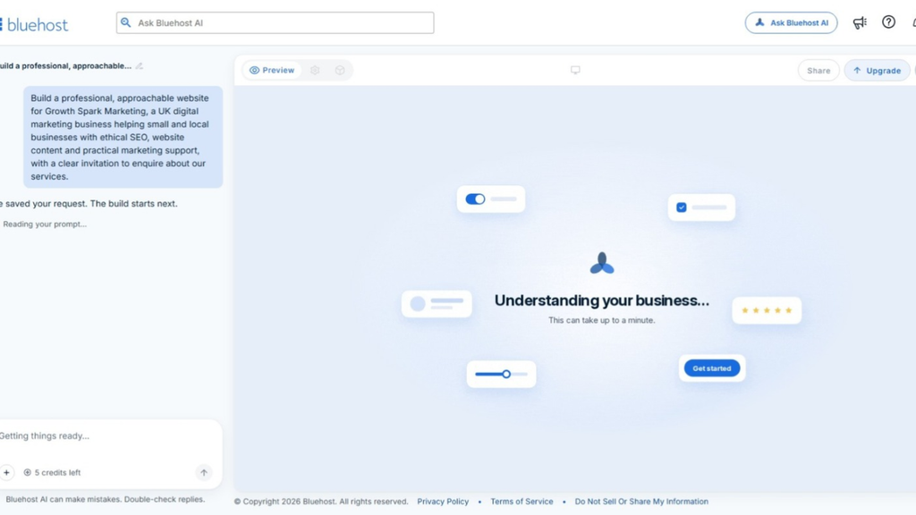
Build a professional, approachable website for Growth Spark Marketing, a UK digital marketing business helping small and local businesses with ethical SEO, website content and practical marketing support, with a clear invitation to enquire about our services.
That supplied the essentials: the business name, its audience, its main services and the action I wanted visitors to take.
However, it left plenty unspecified. I had not supplied contact details, prices, exact page copy or destinations for the enquiry buttons.
This was enough to test the initial build, but not enough to expect every business detail to be correct.
The first result: a coherent website, not an empty shell
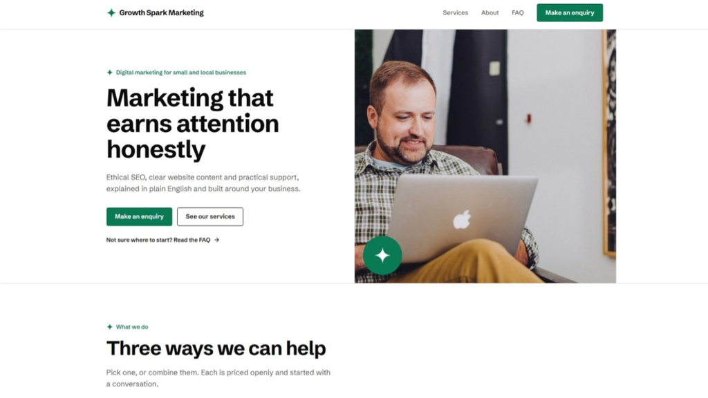
The opening headline was:
“Marketing that earns attention honestly”
That felt appropriate for the ethical, straightforward positioning I wanted.
The supporting text explained the services in plain English, and the opening section included buttons to make an enquiry or explore the services.
Further down, the builder created three service sections:
- Ethical SEO.
- Website content.
- Practical marketing support.
It also included a section about the business’s principles, an FAQ area, a further enquiry section and a footer.
Visually, the page held together. The green, black and white colour scheme ran consistently through the design, and the sections felt like parts of the same website rather than unrelated blocks.
I particularly liked that the result gave me something substantial to assess. I was not looking at an attractive headline followed by a collection of empty spaces.
As someone who works with website content, I was also pleased that the wording broadly followed the direction of the prompt. It focused on small businesses, practical support and plain English.
My first reaction was that it looked great. The next job was to find out what needed changing.
Making a real change through chat
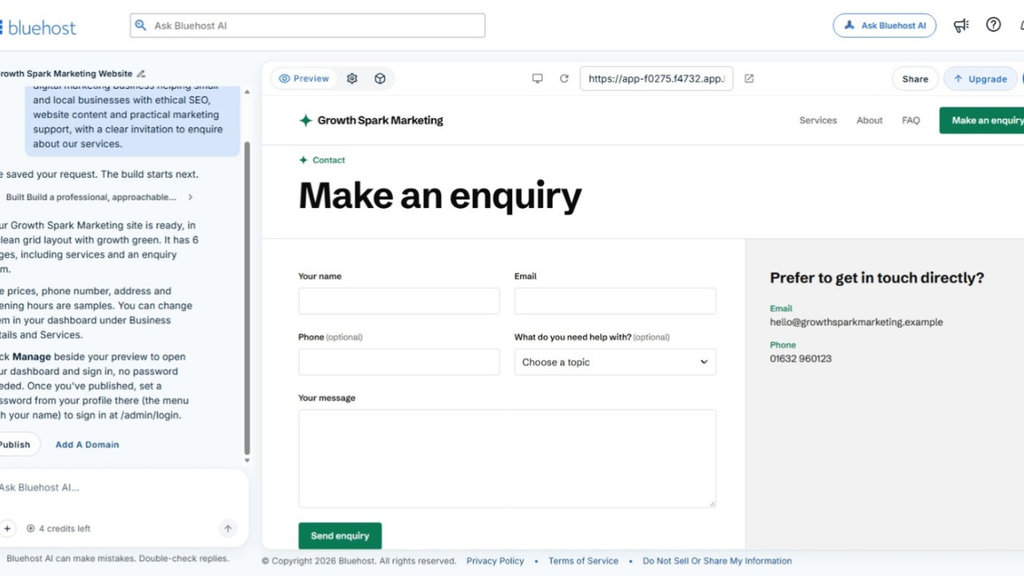
My first follow-up request was practical rather than cosmetic: add my email address and phone number across the site.
Around two minutes later, the update was done.
This was a good example of the appeal of conversational editing. I could explain the outcome I wanted rather than manually work through each section to add the same information.
I could have supplied those details in the original prompt. In hindsight, that would have been more efficient. However, adding them afterwards let me test how the builder responded to a genuine instruction.
For this particular change, the process was straightforward.
It is worth separating that result from a broader claim about functionality, though. Having contact details displayed does not establish that every button, email link or enquiry form works correctly. Those still need checking individually.

The detail I would not leave unchecked: generated prices
The services section included prices for SEO, website content and marketing support.
I had not supplied those figures.
They looked plausible and fitted neatly into the design. That was precisely why they deserved attention: they did not look obviously out of place, but they were not information I had provided.
For me, this was the most important caution from the test.
A polished layout can make a website feel more complete than it really is. You still need to read what the AI has written and check it against your actual business.
Prices, contact details, service descriptions, testimonials and claims about results should not be accepted simply because they appear in a well-designed section.
Next time, I would include this instruction in my opening brief:
Use only the business information I provide. Do not invent prices, testimonials, client results, qualifications or guarantees. Ask me if essential information is missing.
I would still review the output afterwards.
This did not undo the quality of the initial design. It showed that generating the presentation and verifying the information are two separate jobs.
How did it look on mobile?
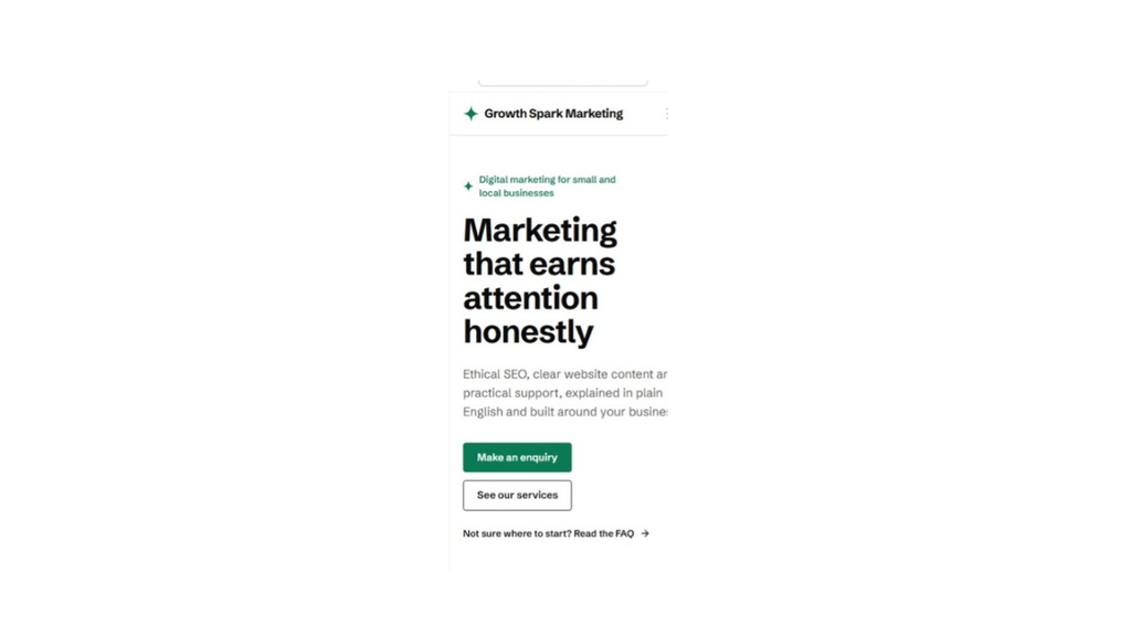
After publishing the site, I opened it on my mobile phone.
My first impression was positive there too. The website looked great on the smaller screen, not just in the desktop view.
That mattered to me because I wanted to assess the published result, rather than rely entirely on what I could see while building it.
This was a visual check, not an exhaustive test of every mobile interaction. I have not separately assessed the tablet layout or verified every button and form.
Even with that limitation, I was pleased with how the design appeared on both desktop and my phone.
Understanding the free plan’s credits
The Free plan provides five credits a day, capped at 30 a month. Bluehost’s campaign brief states that one message uses one credit, while the AI’s clarifying questions are free.
That allowance is worth understanding before you start refining the site.
I am a perfectionist. Once I have a design in front of me, it is easy to notice a sentence I would reword, a section I would rearrange or a detail I would like to improve.
If every small adjustment becomes a separate request, the daily allowance can shape how much you get done in one session.
My approach would be to reserve the AI requests for meaningful changes and use the manual editing options I explored for smaller adjustments where available.
For example, rather than sending several separate requests about the same section, I would review it first and describe the changes clearly in one instruction.
The alternative is to work over several days and continue when the daily allowance refreshes, provided you still have monthly credits available.
The Free plan gives you a way to build and publish a real website. It should not be confused with unlimited AI editing.
Does running out of credits take your website offline?
According to Bluehost’s stated plan information, running out of credits pauses new changes; it does not take the published website offline. Hosting does not consume credits.
That is a useful distinction.
The credits are connected to making changes through the builder, rather than keeping an already published site online.
I did not independently test every exhausted-credit scenario during this review, so I am describing Bluehost’s stated behaviour rather than a result I personally verified.
Publishing on the free Bluehost subdomain
I published the Growth Spark Marketing demonstration using the supplied Bluehost subdomain.
That completed the core process I wanted to test: start with a business description, generate a website, request a change and publish the result.
I did not need to connect my existing business domain for this exercise.
If you want to use your own domain, you need a paid plan. Connecting a domain you already own is separate from registering or renewing one, so check those arrangements rather than assuming they are the same thing.
Publication is also not a substitute for a final review.
Before using a site like this for customer enquiries, I would check the business information, remove unsupported claims, confirm the prices and test the navigation and contact journey.
In my test, the generated prices were a clear example of something that needed attention before treating the site as a finished representation of the business.
What I would put in a more detailed prompt
The short prompt worked well for generating the initial structure and appearance.
My recommendation, however, would be to invest a little more thought at the beginning. Give the builder the facts it needs rather than expecting it to infer them.
For a service-business website, I would include:
- The business name and the customers it serves.
- Accurate descriptions of the services.
- The tone of voice and preferred spelling.
- The contact information you want displayed publicly.
- Actual prices, or a clear instruction not to display prices.
- The required pages or sections.
- The main call to action and its destination.
- Brand colours, a logo and suitable images, where available.
- An instruction not to invent business facts.
Then I would review the site page by page.
My priority would be accuracy and functionality first, followed by finer design adjustments. There is little point perfecting the wording around an enquiry button if the button itself still needs connecting.
A detailed prompt will not remove the need for checking. It gives the builder a better brief and gives you a clearer standard against which to judge the result.
Who might find Bluehost AI Builder useful?
Based on this experience, I can see the appeal for small service businesses, freelancers and consultants who want help getting beyond the blank-page stage.
You still need to understand your offer and supply accurate information. However, you are not starting by designing every section yourself.
It is particularly interesting if you prefer explaining the outcome you want rather than working through every layout decision individually.
The Free plan also lets you assess the approach before deciding whether a paid plan is worthwhile for your needs.
There are boundaries to keep in mind. Bluehost AI Builder is not currently positioned as a store builder. If your aim is to sell products online, Bluehost directs that audience to Bluehost AI Store instead.
My test focused on a marketing-services website. It was not a test of ecommerce, a complex web application or every feature available on the paid plans.
My verdict: an impressive starting point that still needs your judgement
Bluehost AI Builder impressed me with what it produced from one short prompt.
The initial website looked professional, contained the main sections I expected and broadly reflected the tone I wanted. Asking it to add my email address and phone number took around two minutes, and I was pleased with how the published site looked on my mobile phone.
The main caution was factual accuracy. The builder supplied prices I had not provided, which reinforced the need to check the content rather than judge the result on appearance alone.
My recommendation is to start with a detailed brief, use your AI requests deliberately and review the result page by page.
I would not describe the process as removing every decision involved in creating a business website. What it did was give me a substantial first version that I could assess and refine, rather than an empty page.
“If you run a small service business and want to see what a chat-based builder can produce, the Free plan gives you a practical way to test it before deciding whether you need a paid plan.”.
If you want to explore the same process, Bluehost AI Builder offers “$0 to start, no credit card”, with “paid plans from $20/mo”.
Try Bluehost AI Builder — $0 to start, no credit card
I earn a commission from qualifying purchases made through this link.